For the passionate aficionado, a cigar band is far more than a mere decorative wrapper; it is a historical artifact that tells the silent story of a brand's journey through time. Nowhere is this visual history more apparent than in the timeline of the Belinda brand. By examining the subtle shifts in typography, color, and manufacturing marks, a collector can decode decades of corporate transitions and industrial changes. The evolution of Belinda's imagery serves as a distinct roadmap, guiding enthusiasts through a century of production that spans from the early days of Cuban independence to the modern era of global standardization.
The Formative Years: Establishing an Identity
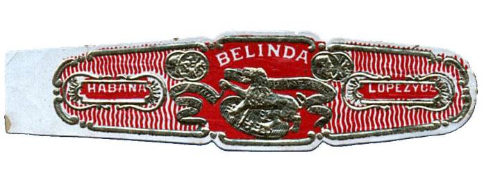
The visual lineage of Belinda begins in the opening decade of the twentieth century. During these nascent years, the branding was inextricably linked to its ownership. The earliest artifacts found by collectors prominently display the name López y Cía, identifying the original proprietors of the marque. These initial designs were characterized by a commitment to texture, utilizing embossing techniques that gave the paper a tactile, three-dimensional quality. This choice in manufacturing set a precedent for the brand, establishing a "classic" look that would define its identity for over half a century. For the historian, these bands serve as the foundational bedrock, proving the brand's longevity and its early entry into the competitive tobacco landscape.
Mid-Century Transitions: Location and Aesthetics
As the calendar turned toward the 1920s, the static nature of the brand's imagery gave way to a dynamic period of relocation and redesign. The packaging began to mirror the physical movement of the factory itself. A key development occurred in the early 1920s, when the bands began to feature the specific address of M. Gonzalez 10. This era is particularly notable for collectors because it introduced a splash of color that differentiated it from the monochromatic past; the bands from this period are distinguished by their striking blue accents. This artistic choice added a layer of decorative flair that remains a highlight for those tracing the brand's aesthetic evolution.
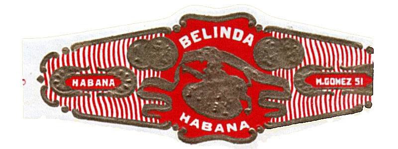
The momentum of change continued into the 1930s, marking perhaps the most enduring design phase of the brand's history. Following another relocation of manufacturing facilities, the bands were updated to reflect a new address: M. Gomez 51. This specific iteration of the band demonstrated remarkable staying power. Unlike the rapid turnover seen in previous decades, this particular embossed design remained in active circulation for over thirty years, enduring through the mid-1960s. The stability of this design offers a stark contrast to the earlier shifts, representing a settled era for the Belinda name.
The Modern Epoch: Standardization and Revival
Following the mid-sixties, the brand experienced a period of transition, eventually leading to a significant visual overhaul in 1989. This year marked the debut of what collectors have termed Standard Band A. This design philosophy represented a departure from the heavily textured past. In a move towards sleeker, more contemporary production, the new bands featured significantly less embossing than their predecessors. This reduction in texture signaled a shift in manufacturing priorities, perhaps favoring efficiency or modern aesthetics over the traditional tactile experience. This version served the brand faithfully for nearly two decades, ceasing production around 2005.
The turn of the millennium brought with it another milestone in the form of Standard Band B. Introduced approximately in 2005, this iteration holds a unique place in the brand's timeline due to its adoption of ICT (International Cigar Tobacco) branding standards. This was a pivotal moment, aligning Belinda with modern global regulations and presentation norms. Interestingly, this modernization did not abandon the brand's heritage entirely. While it adhered to new codes, it also marked a return to embossed detailing, effectively merging the contemporary requirements of the tobacco industry with the traditional decorative elements that defined Belinda's origins.
A Collector's Chronology
To aid in the identification of these distinct historical periods, one can look for specific markers that define each era of production. The following breakdown highlights the essential characteristics to look for:
- c. 1900s – c. 1920s: Look for the name López y Cía prominently displayed. These bands are defined by their early embossing techniques.
- Early 1920s – c. 1930s: This short-lived design is identified by the address M. Gonzalez 10 and is distinctive for its use of blue highlights.
- c. 1930s – mid 1960s: A long-running classic featuring the M. Gomez 51 address, maintaining the traditional embossed style.
- 1989 – c. 2005: Known as Standard Band A, this period is characterized by a reduction in embossing and a cleaner aesthetic.
- c. 2005 – Present: Standard Band B introduced ICT standards while simultaneously returning to the embossed textures of the past.